View From A
Blue Moon Film
Hurley
Hurley
View From A Blue Moon is a critically-acclaimed surf film by John Florence and Blake Vincent Kueny. After collaborating with Florence and Kueny to establish the film’s essence, we determined that a transcendent, cinematic aesthetic would set the film apart. For the identity, it was crucial to convey the film’s purpose: to document the world through Florence’s viewpoint
View From A Blue Moon is a critically-acclaimed surf film by John Florence and Blake Vincent Kueny. After collaborating with Florence and Kueny to establish the film’s essence, we determined that a transcendent, cinematic aesthetic would set the film apart. For the identity, it was crucial to convey the film’s purpose: to document the world through Florence’s viewpoint
View From A Blue Moon is a critically-acclaimed surf film by John Florence and Blake Vincent Kueny. After collaborating with Florence and Kueny to establish the film’s essence, we determined that a transcendent, cinematic aesthetic would set the film apart. For the identity, it was crucial to convey the film’s purpose: to document the world through Florence’s viewpoint
JOHN’S VIEW
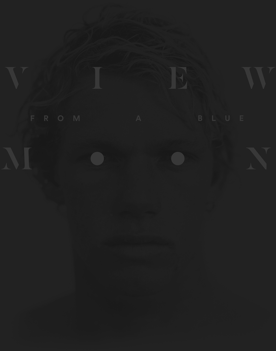
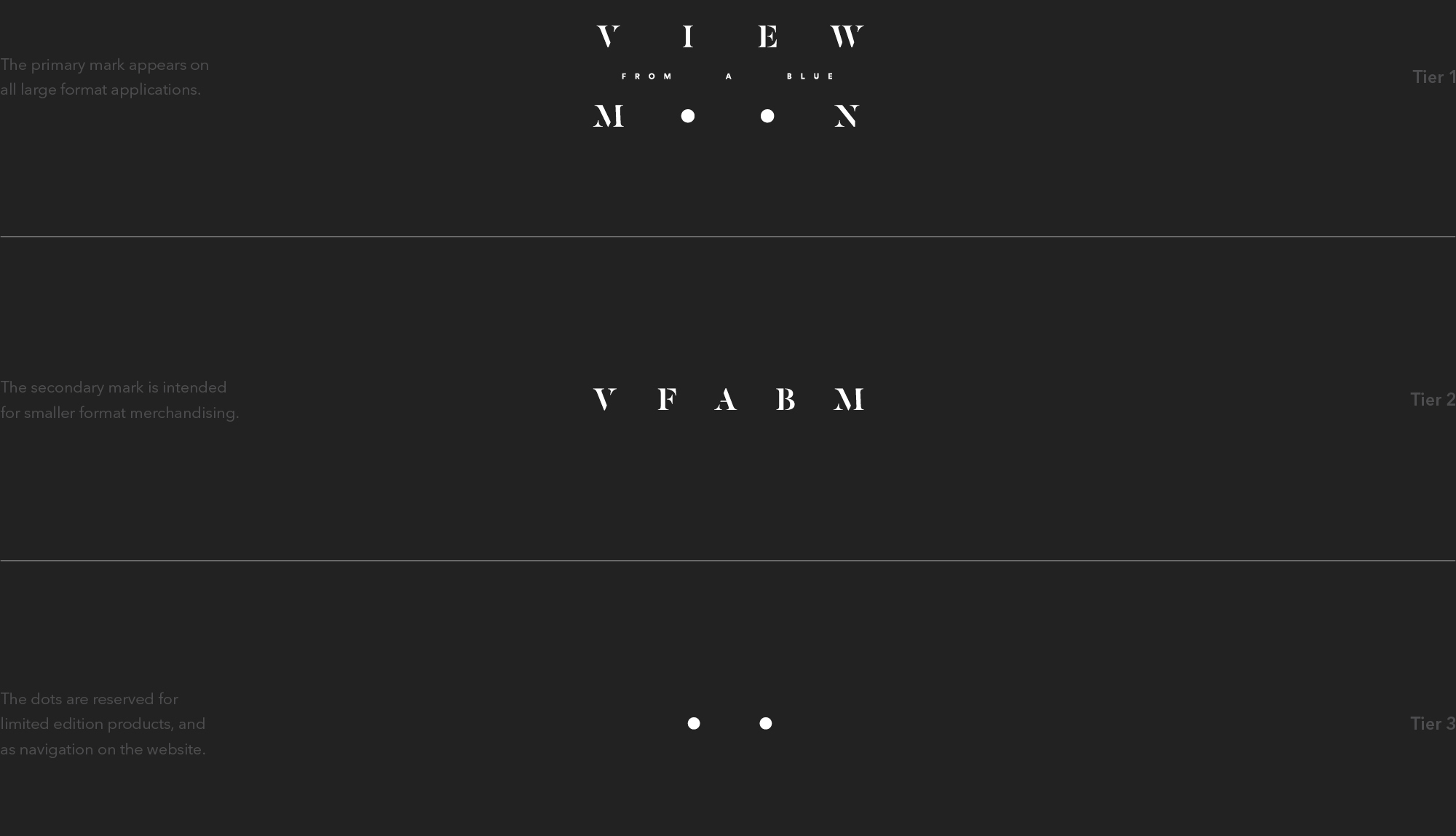
The identity is based on Florence’s perspective, a call back to the film’s purpose. The letters “o” in moon are emphasized as graphic dots to represent eyes and serve as a subtle nod to a blue moon—the second full moon in a calendar month. These dots are utilized within the identity system for smaller applications and as waypoints for motion graphics. To coincide with 2015’s blue moon, the film’s launch teaser was released on July 31 at exactly 3:42 am PST. This revealed the film’s widely-anticipated name and identity to the public.

LOGOTYPE EXPLORATION
LOGOTYPE

SCALING SYSTEM
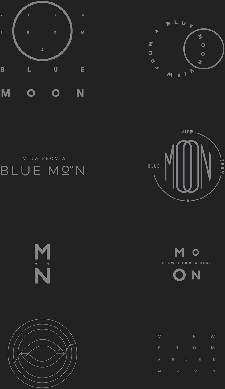
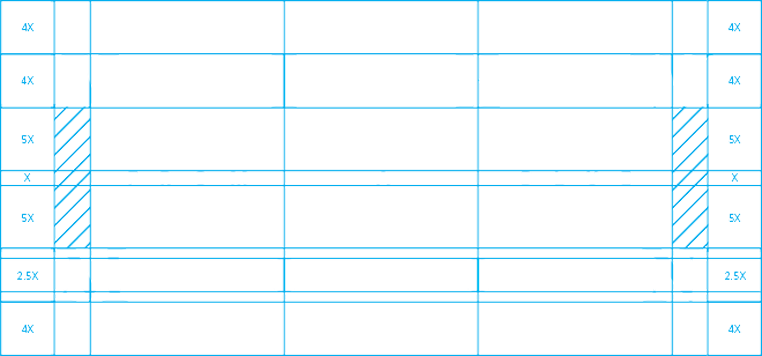
Three logotypes were created to accommodate large and small applications.
COLOR AND TYPOGRAPHY
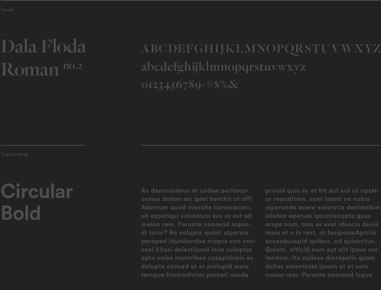
Black, white, and silver dominate the color palette. Those colors are intrinsically meaningful to Florence’s outlook: He shies away from the spotlight and primarily shoots black and white photography. These classic, minimalist tones juxtapose the bright tropical colors prevalent throughout the film’s surfing sequences. We chose multiple typefaces—Circular and Dala Floda—for flexibility in application and scalability, and to highlight contrasts in tone and aesthetic. Circular is an easily readable sans serif that is powerful, but also warm; it quickly communicates crucial information. Dala Floda, a highly-stylized typeface with stencil letterforms, provides a refreshing contrast to Circular.

TITLE SEQUENCE
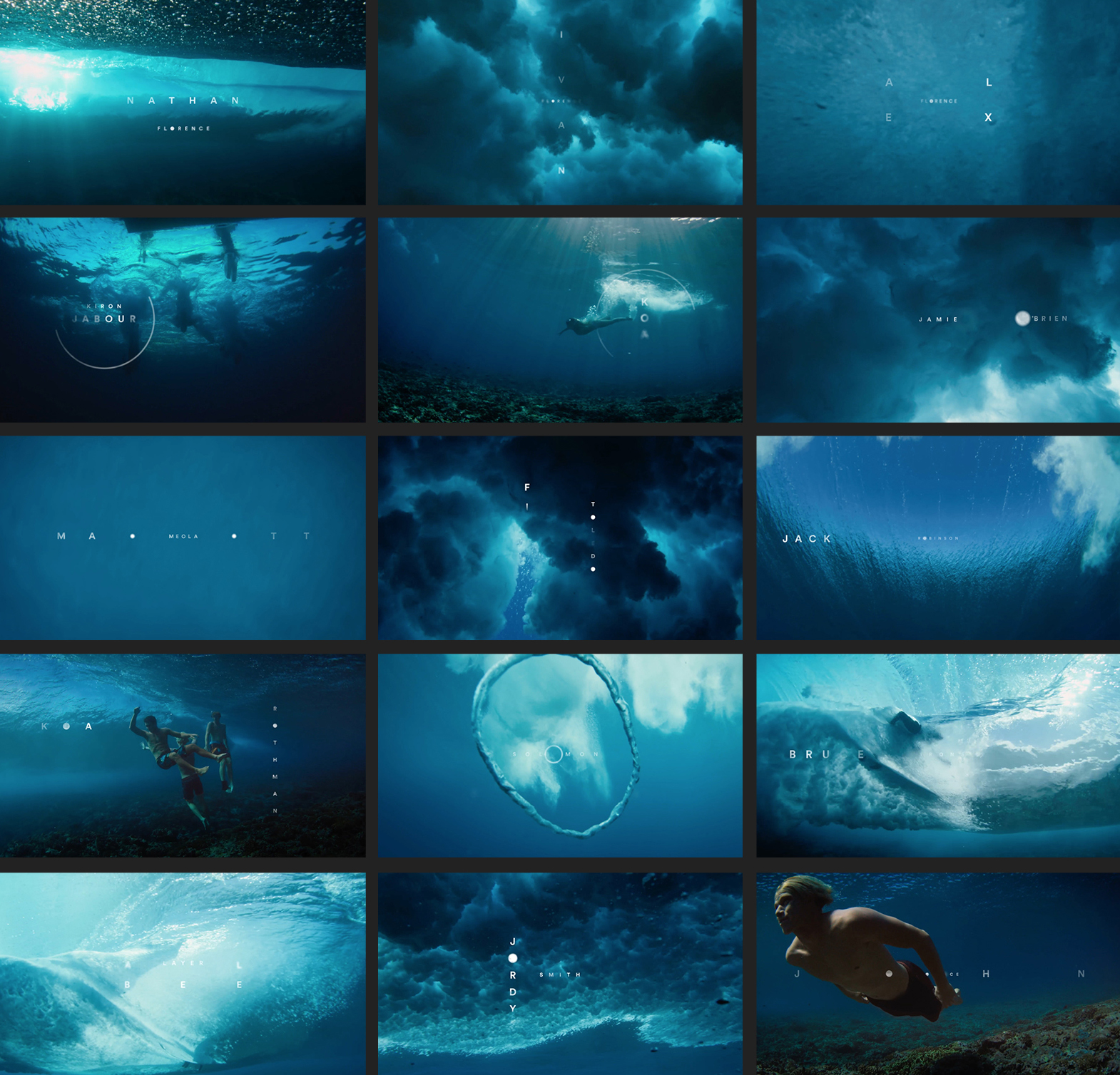
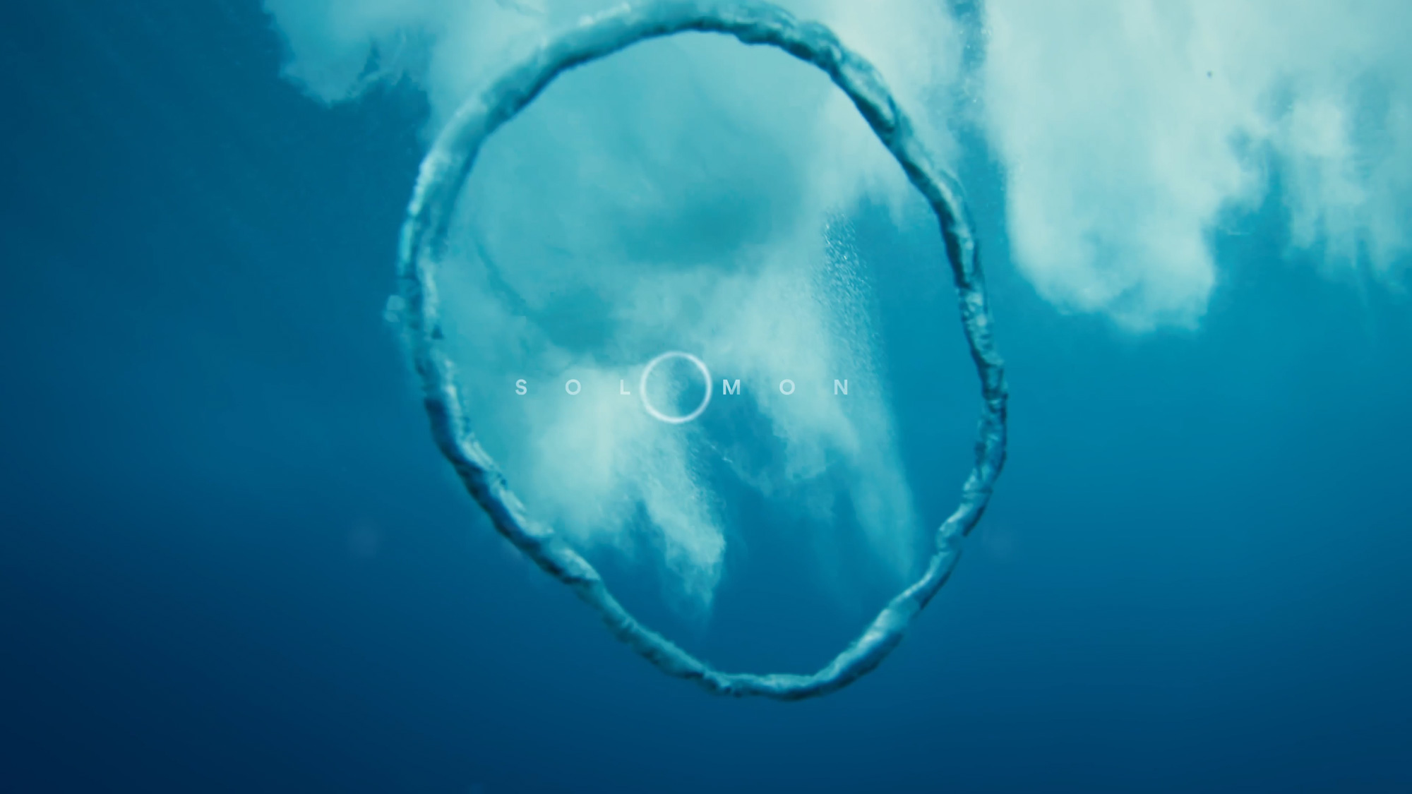
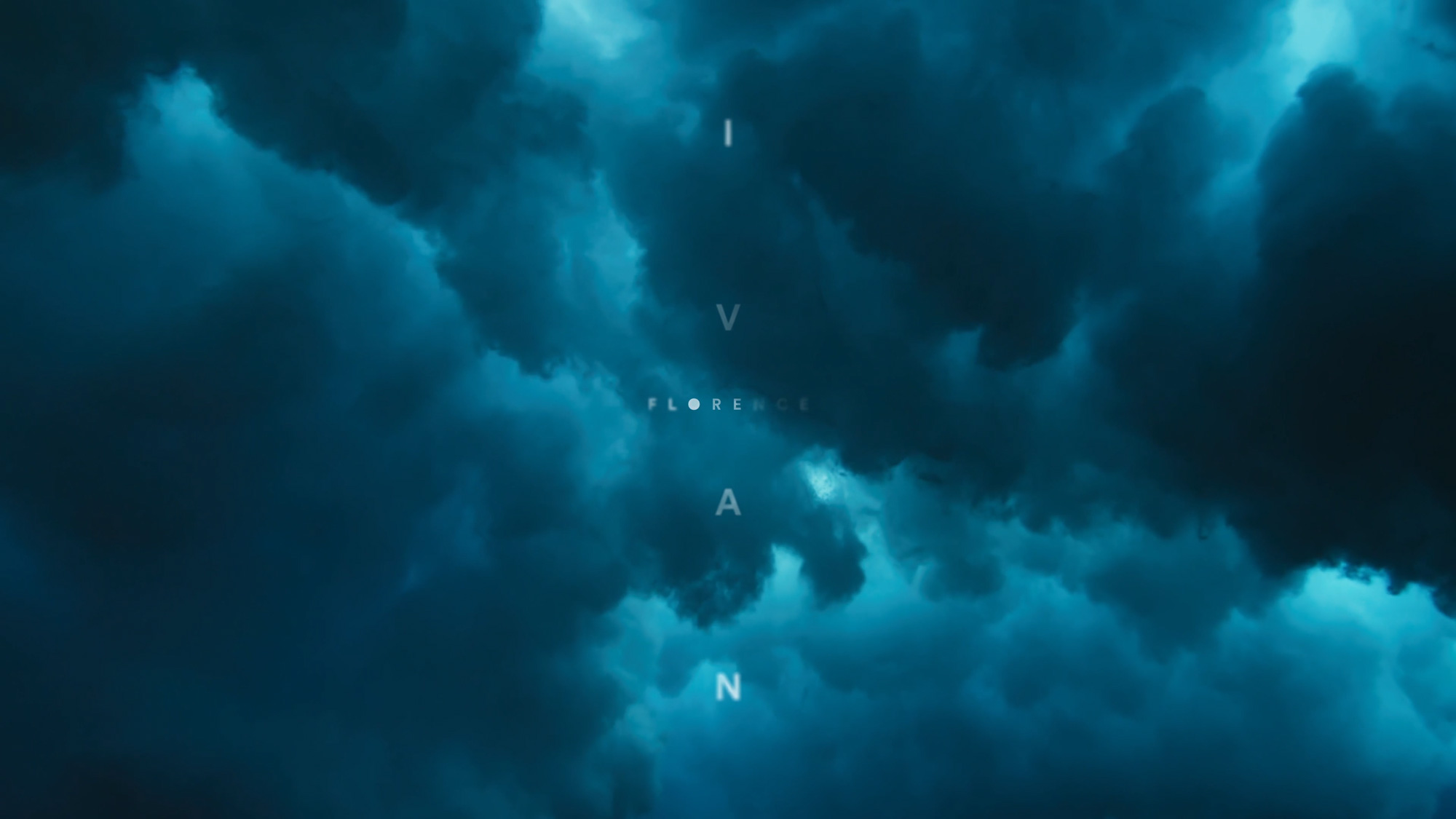
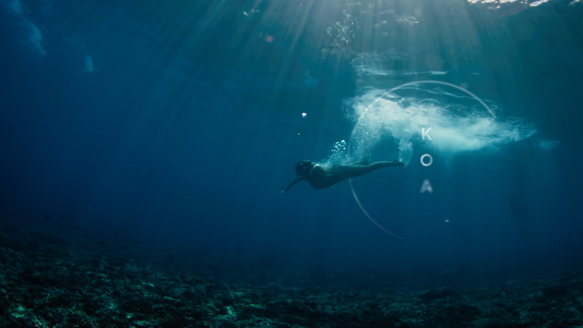
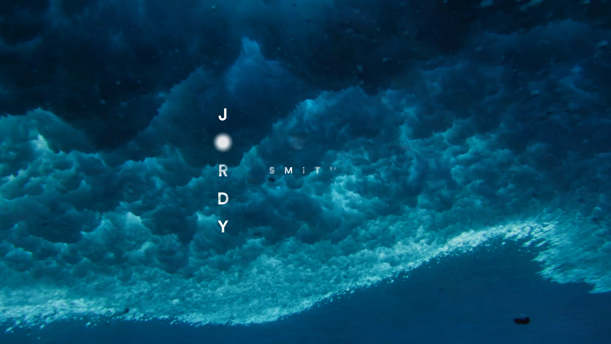
The title sequence marks a firm visual break in the film from background narrative to action. Composed of abstract underwater shots, the stunning cinematography engulfs the viewer into the tranquil yet treacherous environment that lies beneath the surface. These razor-sharp rock formations serve as the foundation for all waves, as well as Florence’s life. Each typographic lockup evokes feelings of structure while simultaneously speaking to the vastness of the ocean. Circular graphic elements are incorporated into many of the lockups to tie back to the identity system.
CHAPTER MOTION
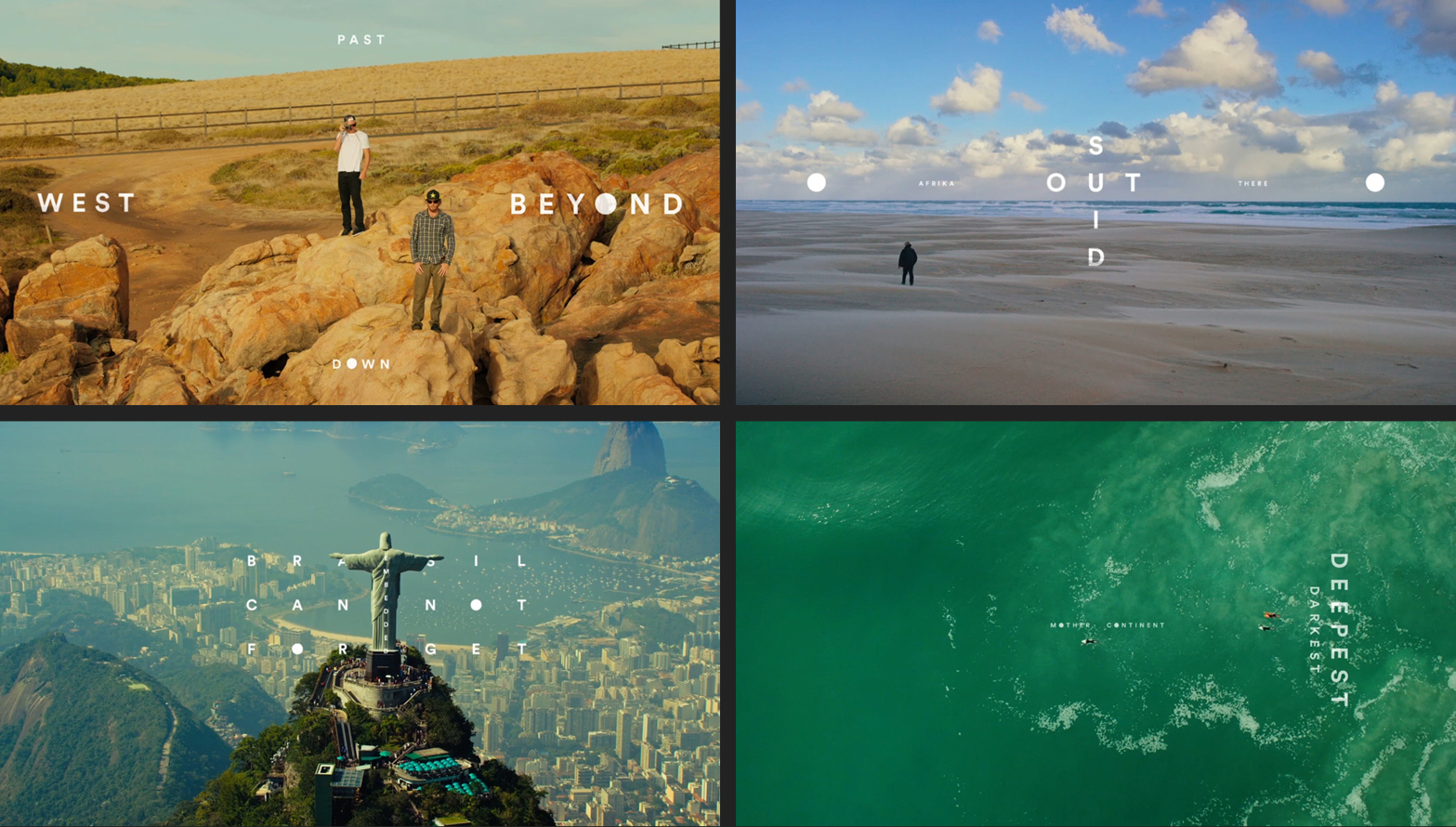
We collaborated with artist CR Stecyk III on the creation of the chapter names in the film. Each one relates to the overarching theme of the location highlighted in the chapter. Circular graphic elements are incorporated into the lockups to maintain the identity system. These names also appear in the View From A Blue Moon book.
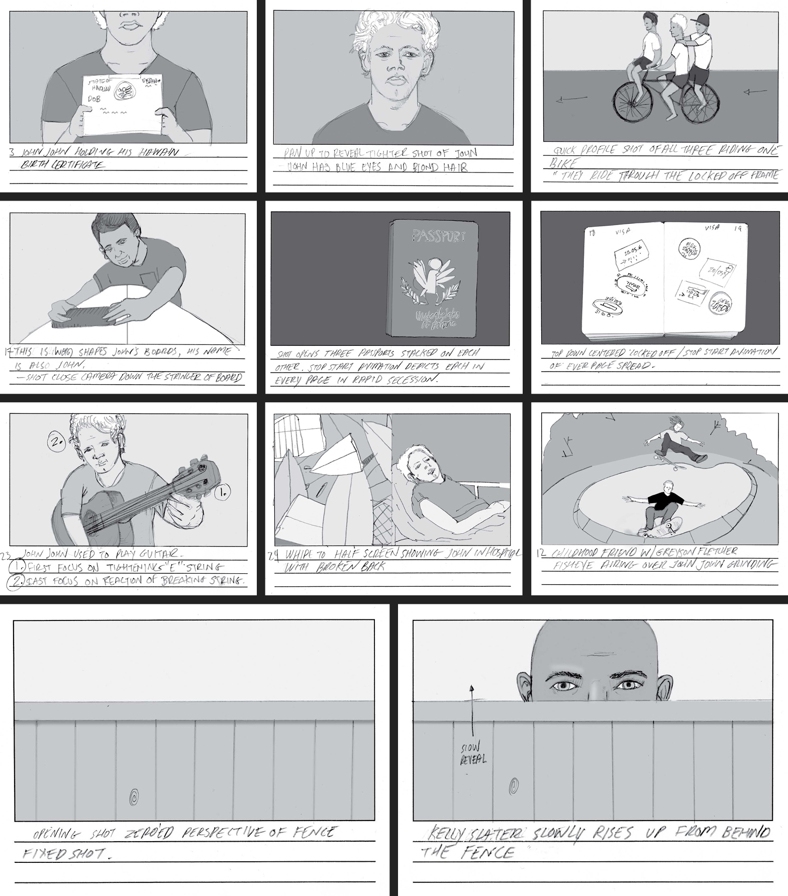
NARRATIVE SEQUENCE STORYBOARDS
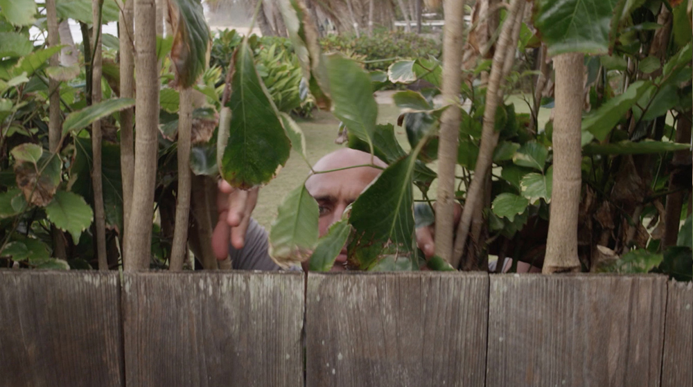
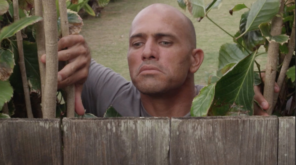
With a list of important moments from and details about Florence’s life in hand, we created over 50 storyboard illustrations to help build Florence’s character through the opening narrative section of the film. Many of these moments included close people in Florence’s life, and we wanted to show them in a humorous light that felt relatable.
CHAPTER QUOTES
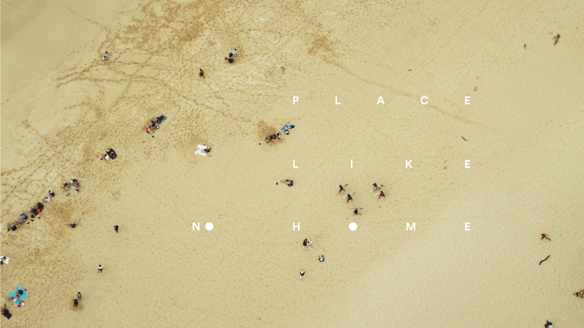
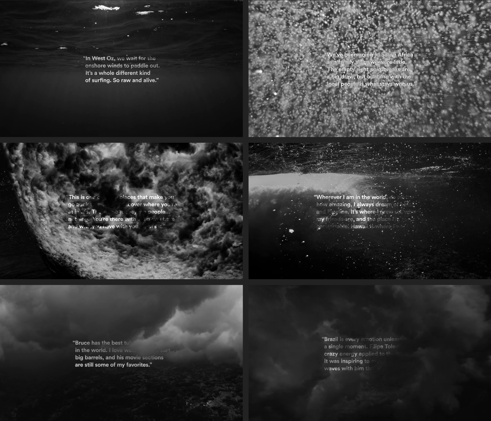
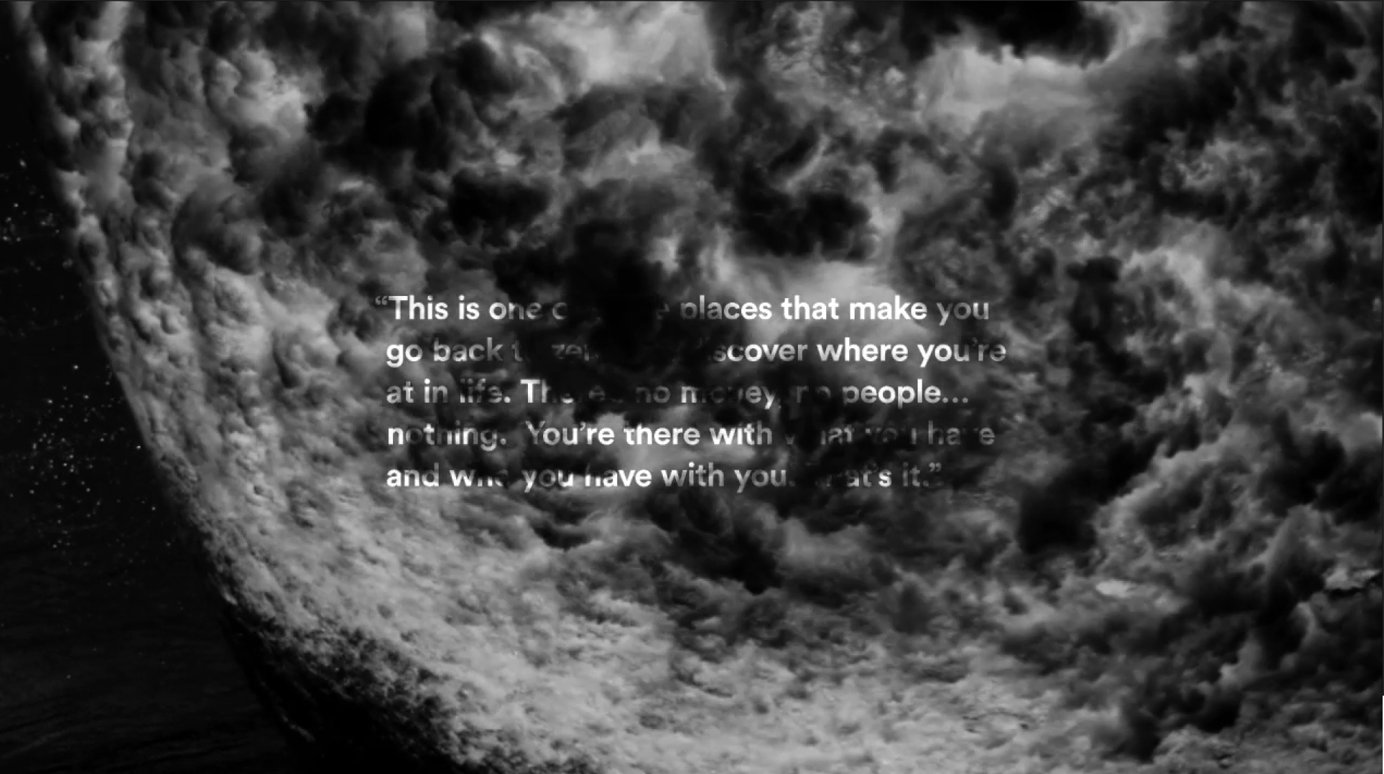
At the beginning of each chapter, quotes from Florence were used to introduce the location. We chose abstract black and white underwater footage to display the quotes in a visually compelling manner. Each quote subtly interacts with the water, signifying the importance of the ocean in Florence’s world.
GLOBAL PREMIERES
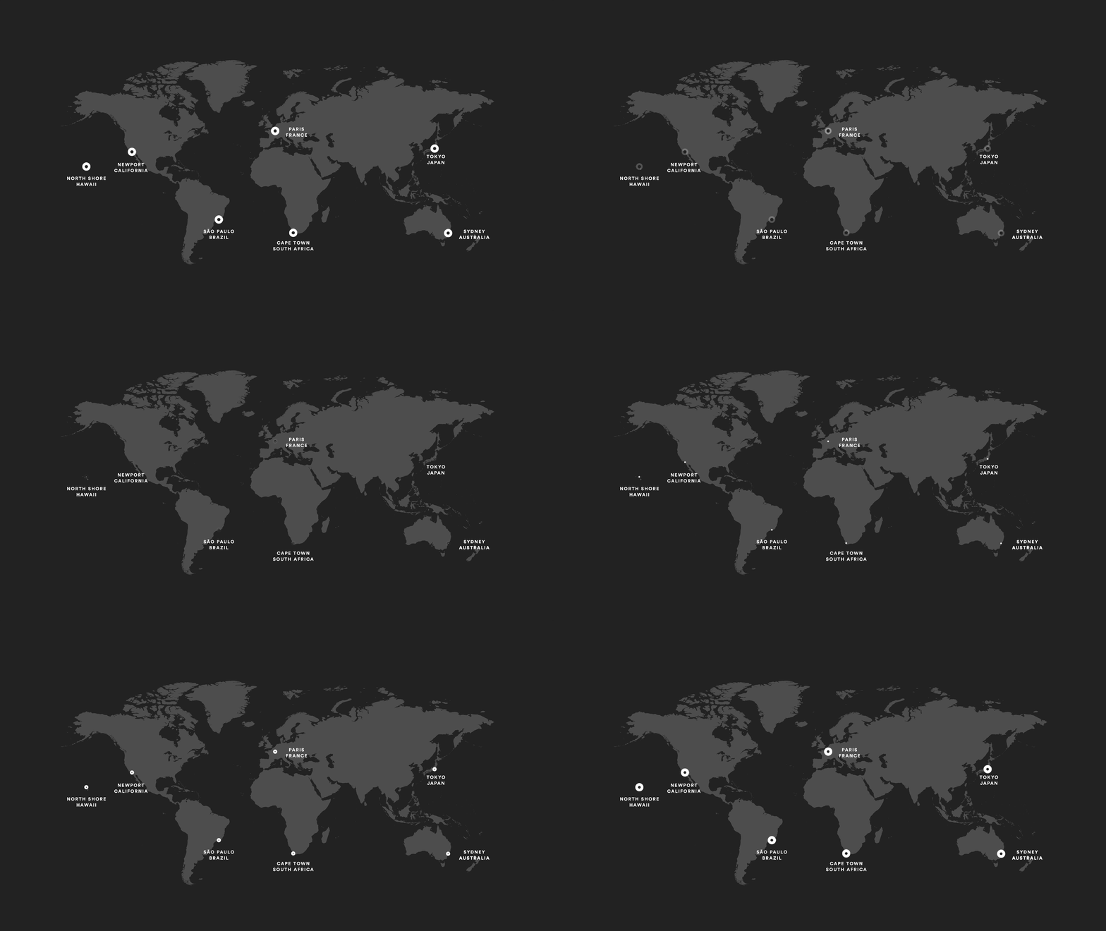
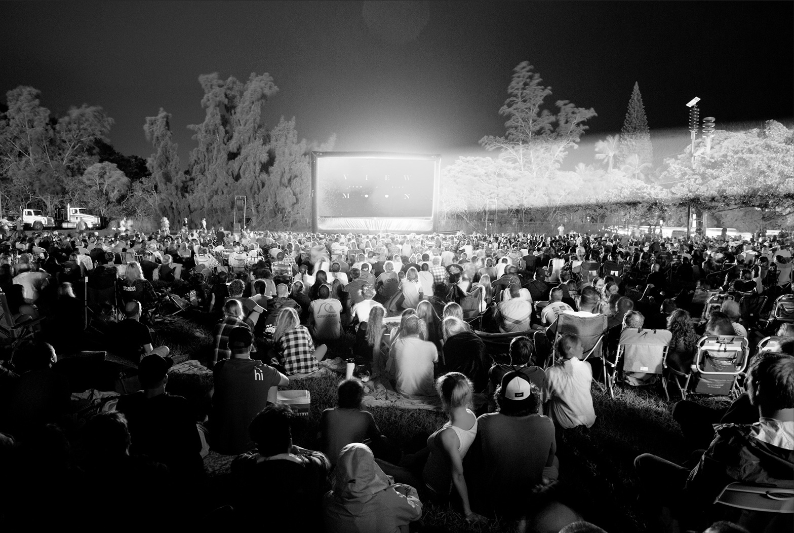
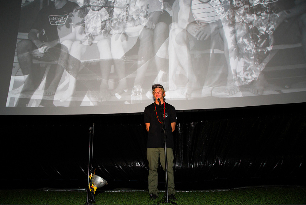
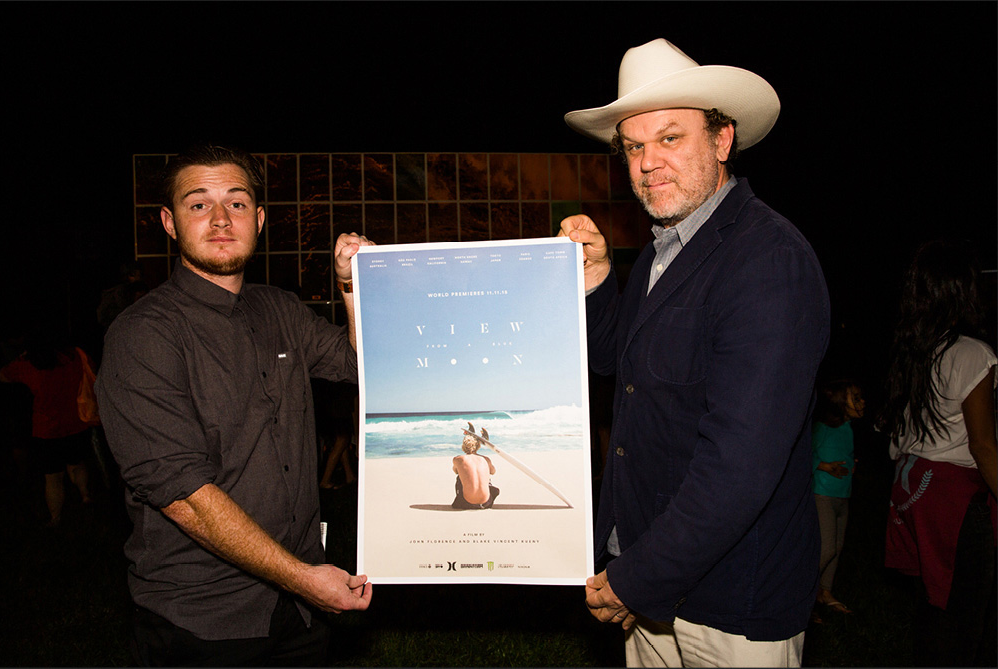
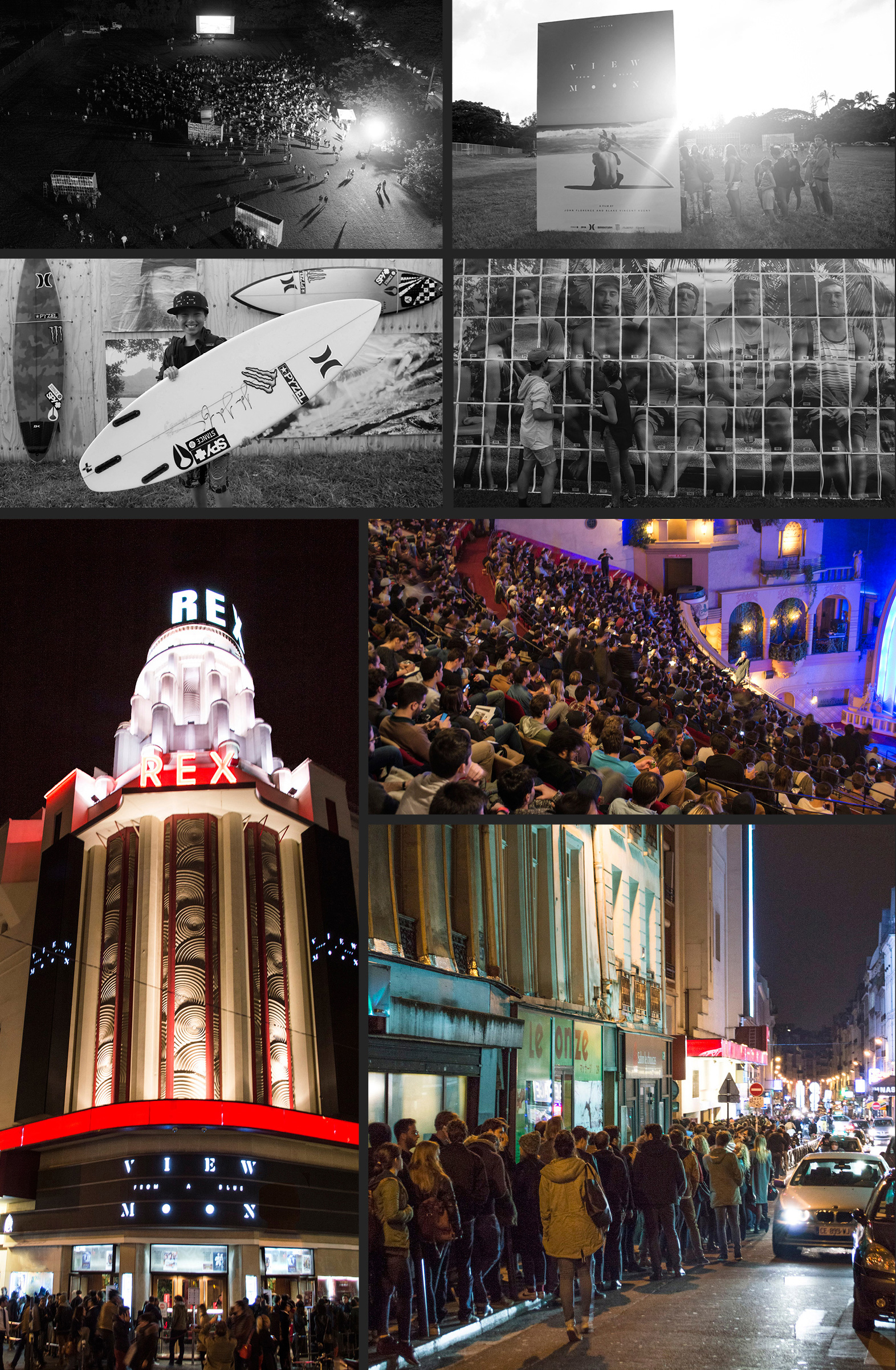
The global premieres were highlighted by the Hawaii event on 11/11 at Sunset Beach Elementary—across from Pipeline, the most iconic wave in surf history—and projected in 4K for over 3,000 guests. To foster brand identity onsite, large blowups of visual stills from the book were installed, and each guest was given a ticket, which was redeemable for a prize only after interacting with the art installations. Sold-out events were held in Sydney, Tokyo, Paris, Sao Paulo, Cape Town, and California, all within 24-hours.
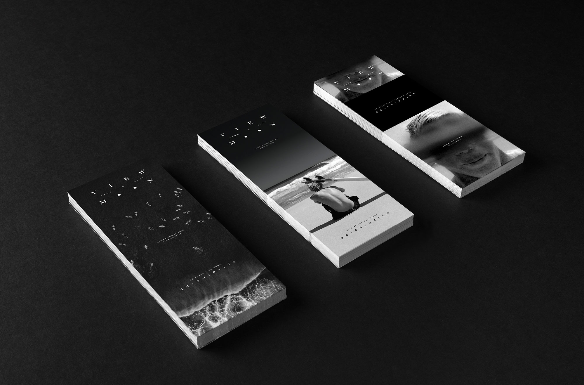
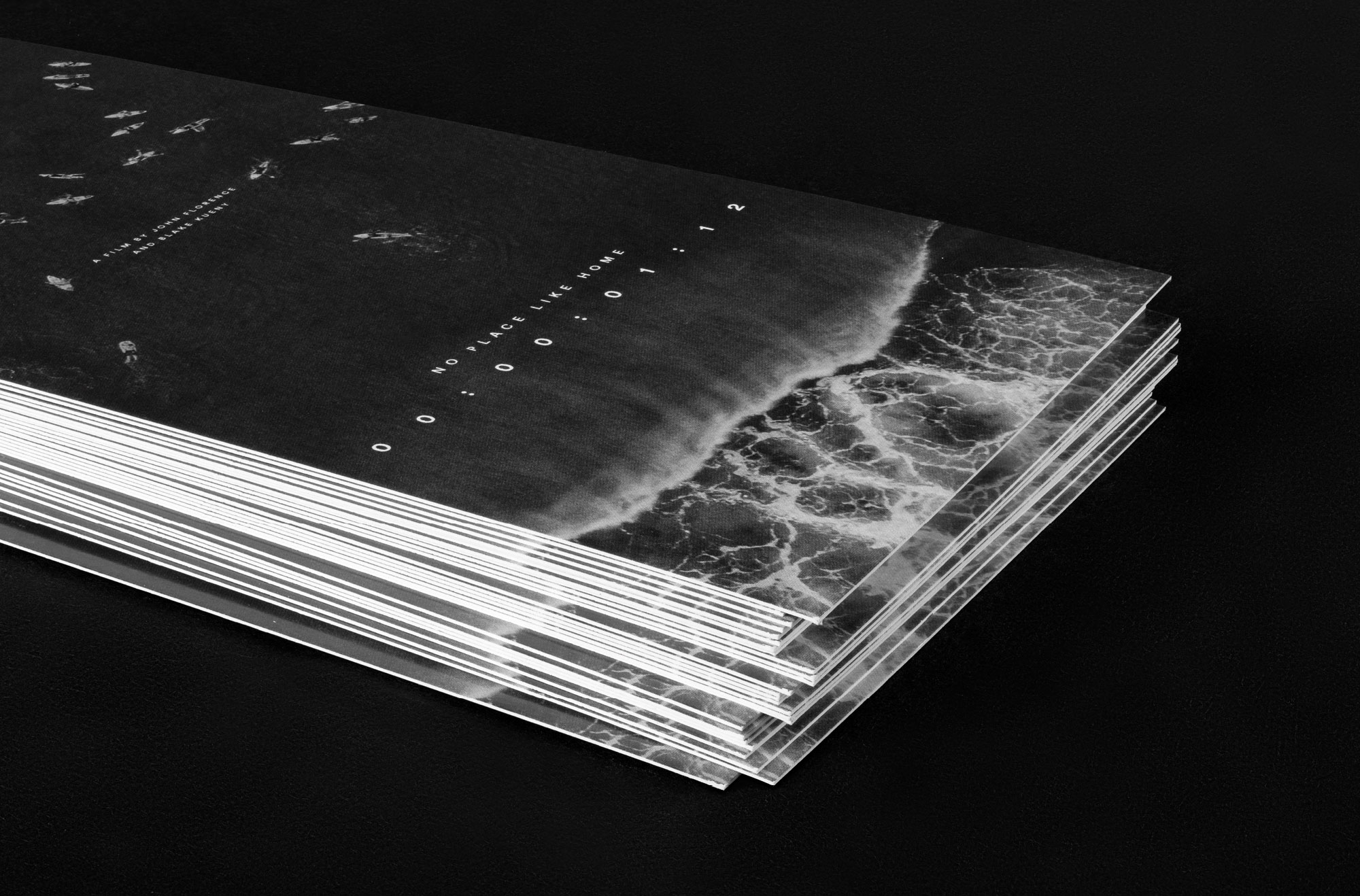
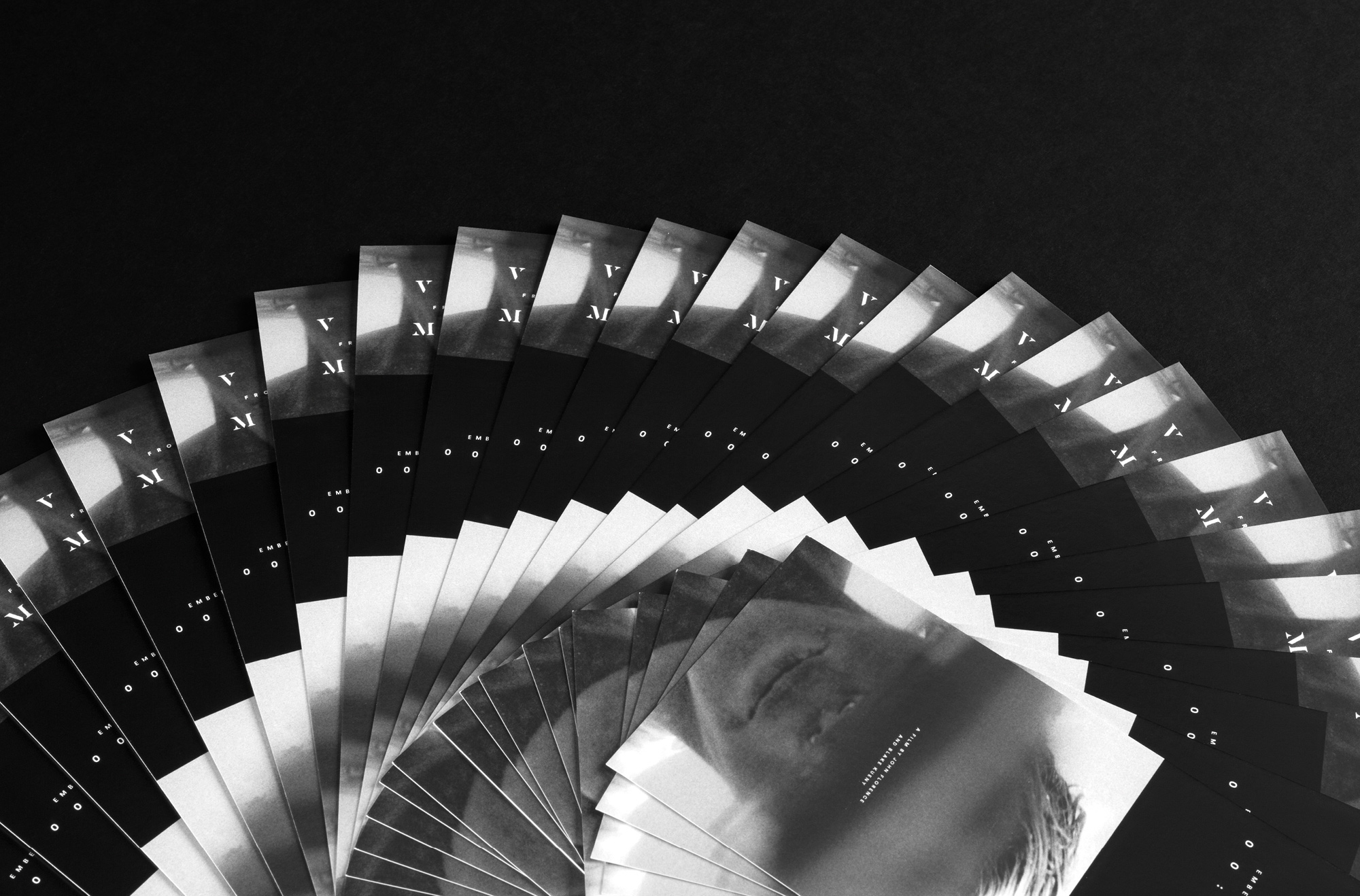
PREMIERE TICKETS
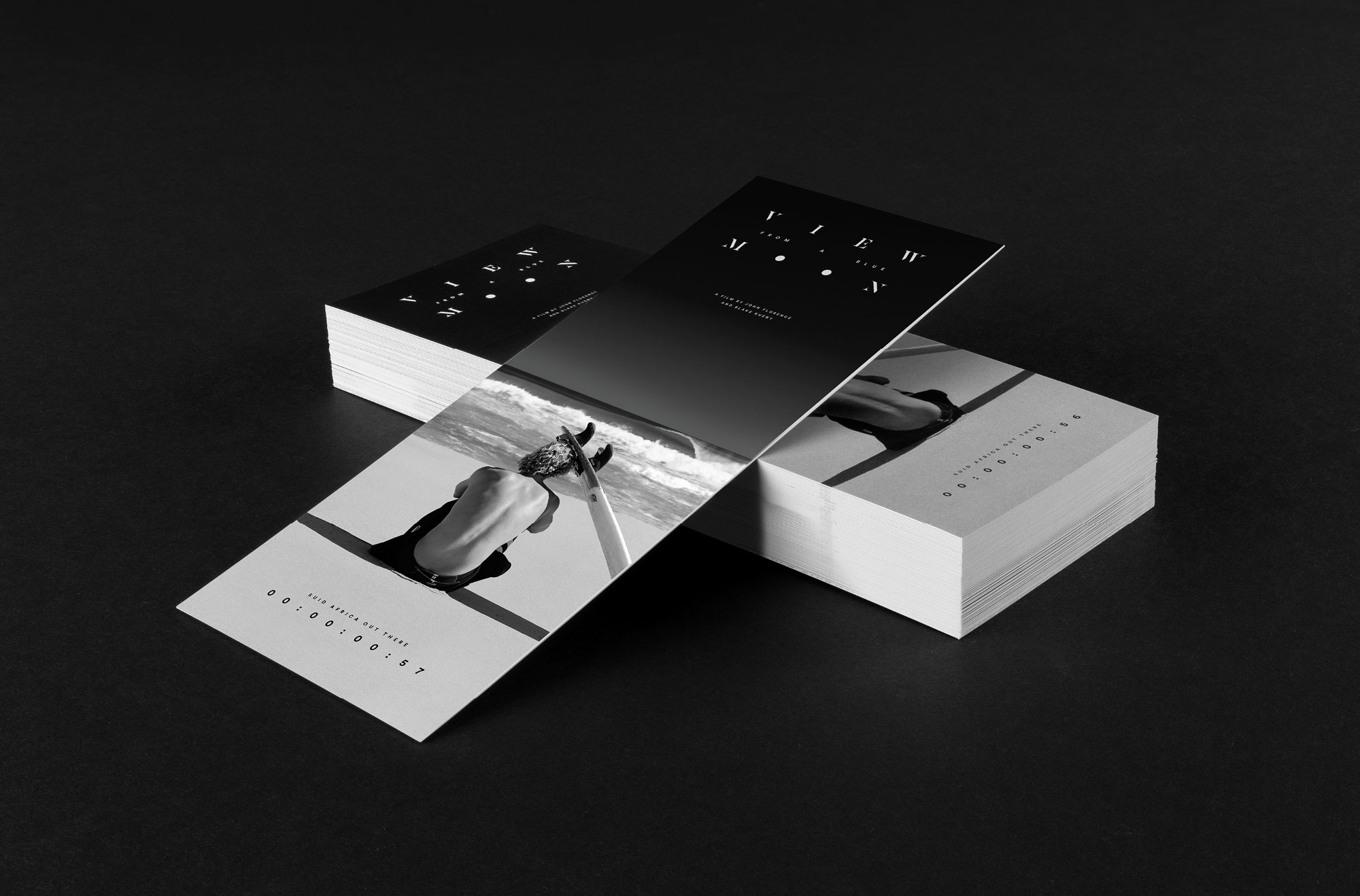
We designed three separate tickets using imagery from the film and book. Each ticket was intended to be used in concert with the interactive installations.
DVD/BLU-RAY PACKAGING
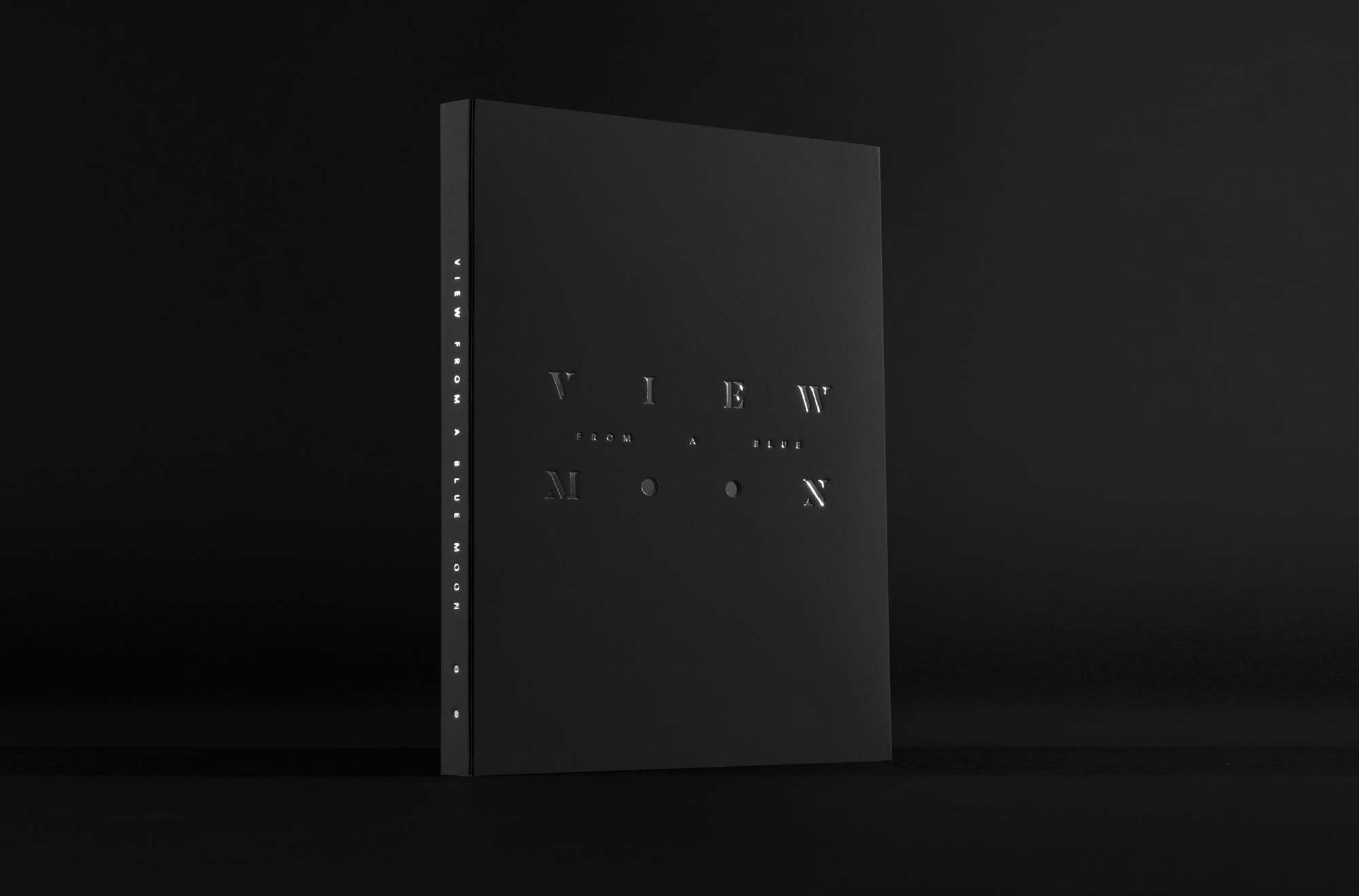
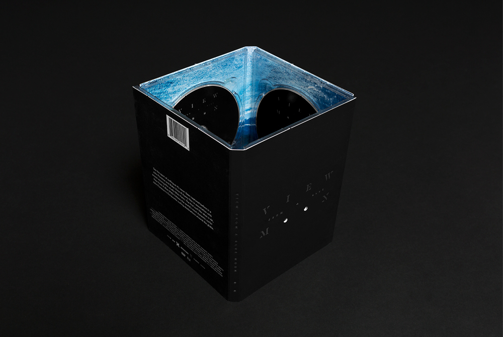
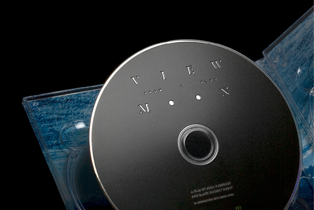
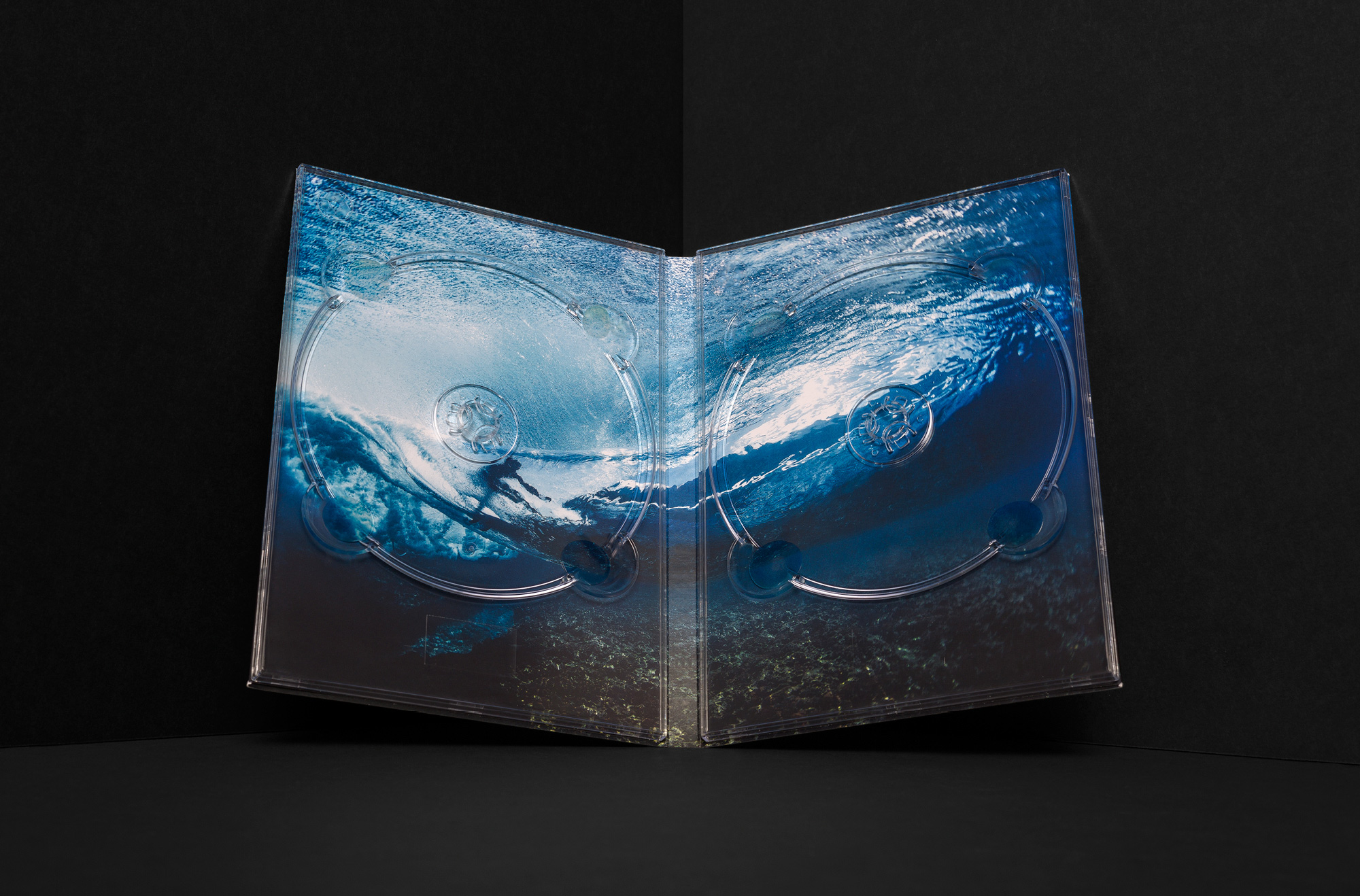
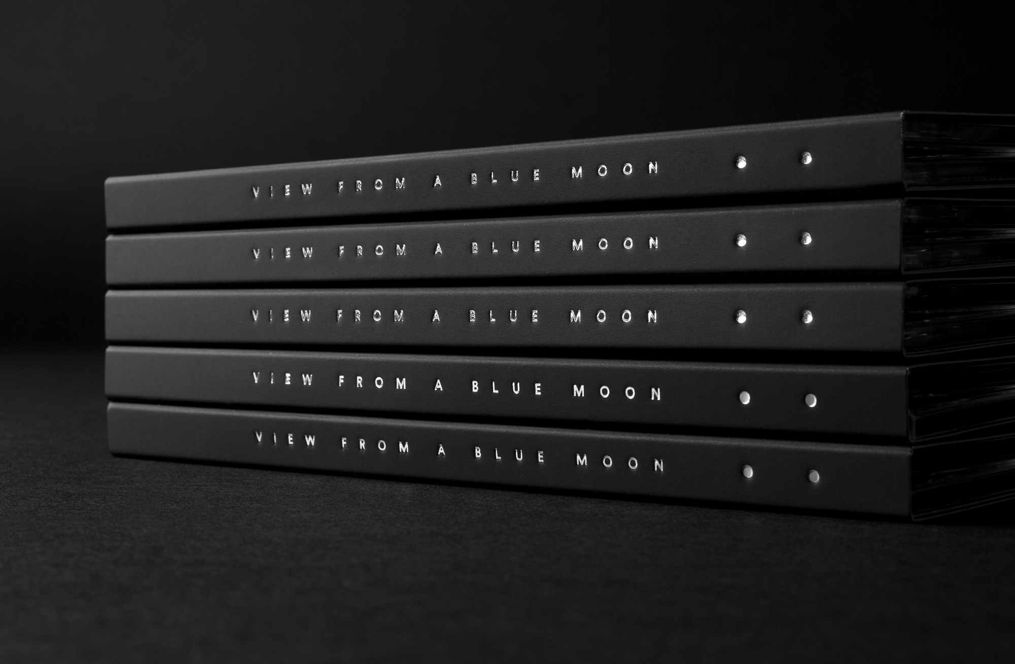
The packaging for the DVD/Blu-Ray focuses on subtle details. The outside features a rich soft-touch black, which contrasts an underwater photo on the inside. The dots in “moon” on the cover are diecut to reveal a silver foil on the inside of the packaging.
POSTER
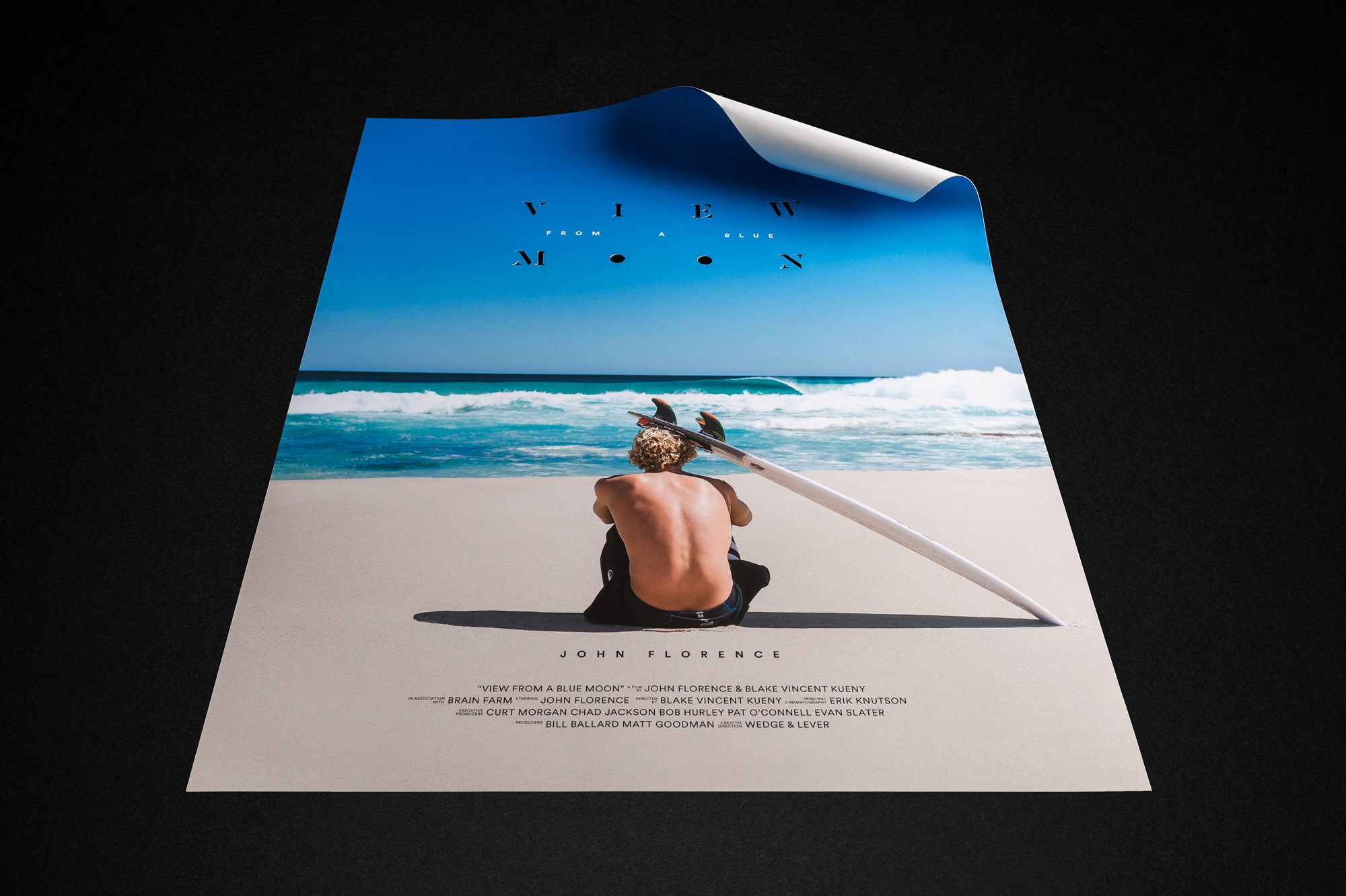
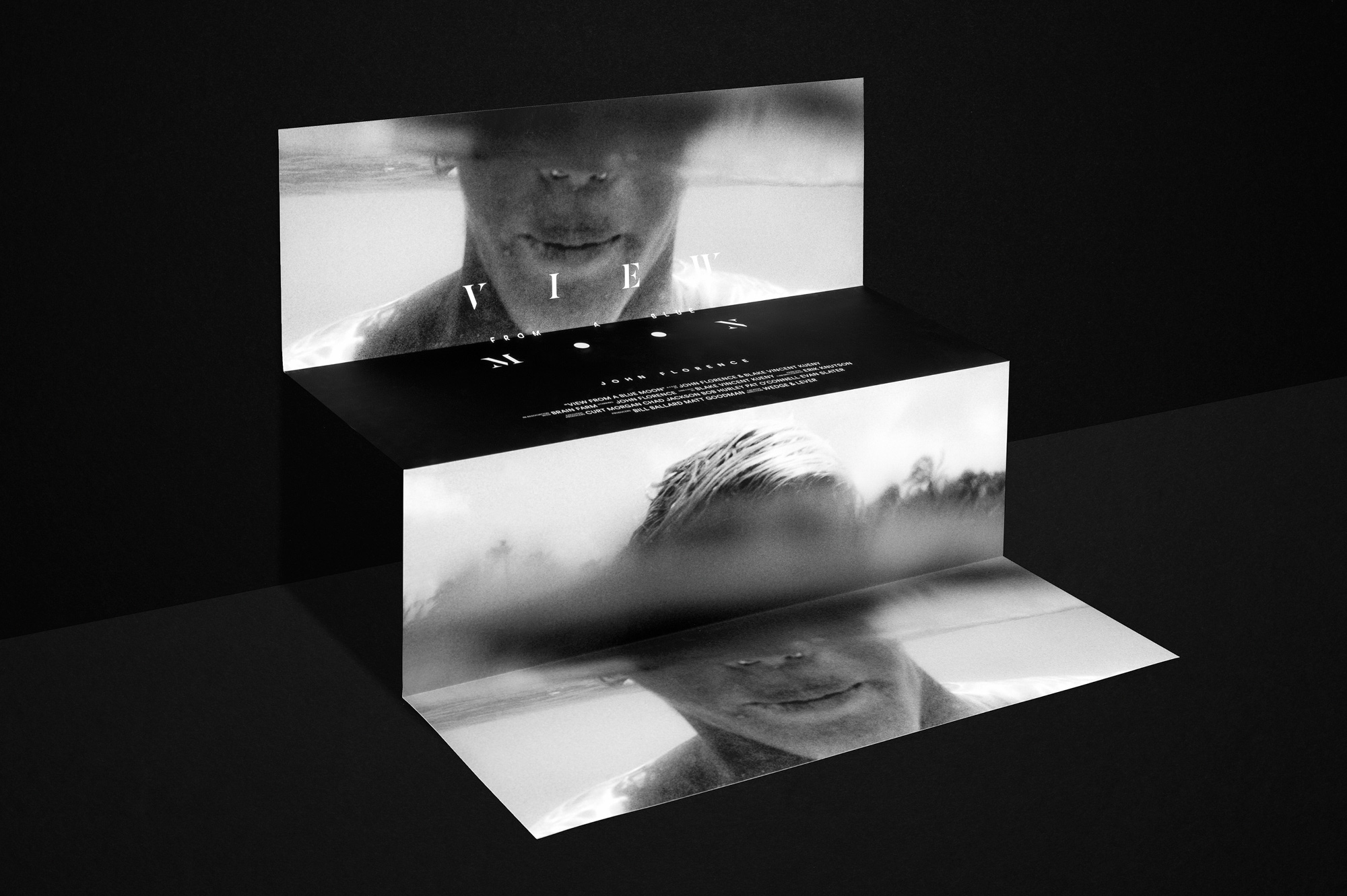
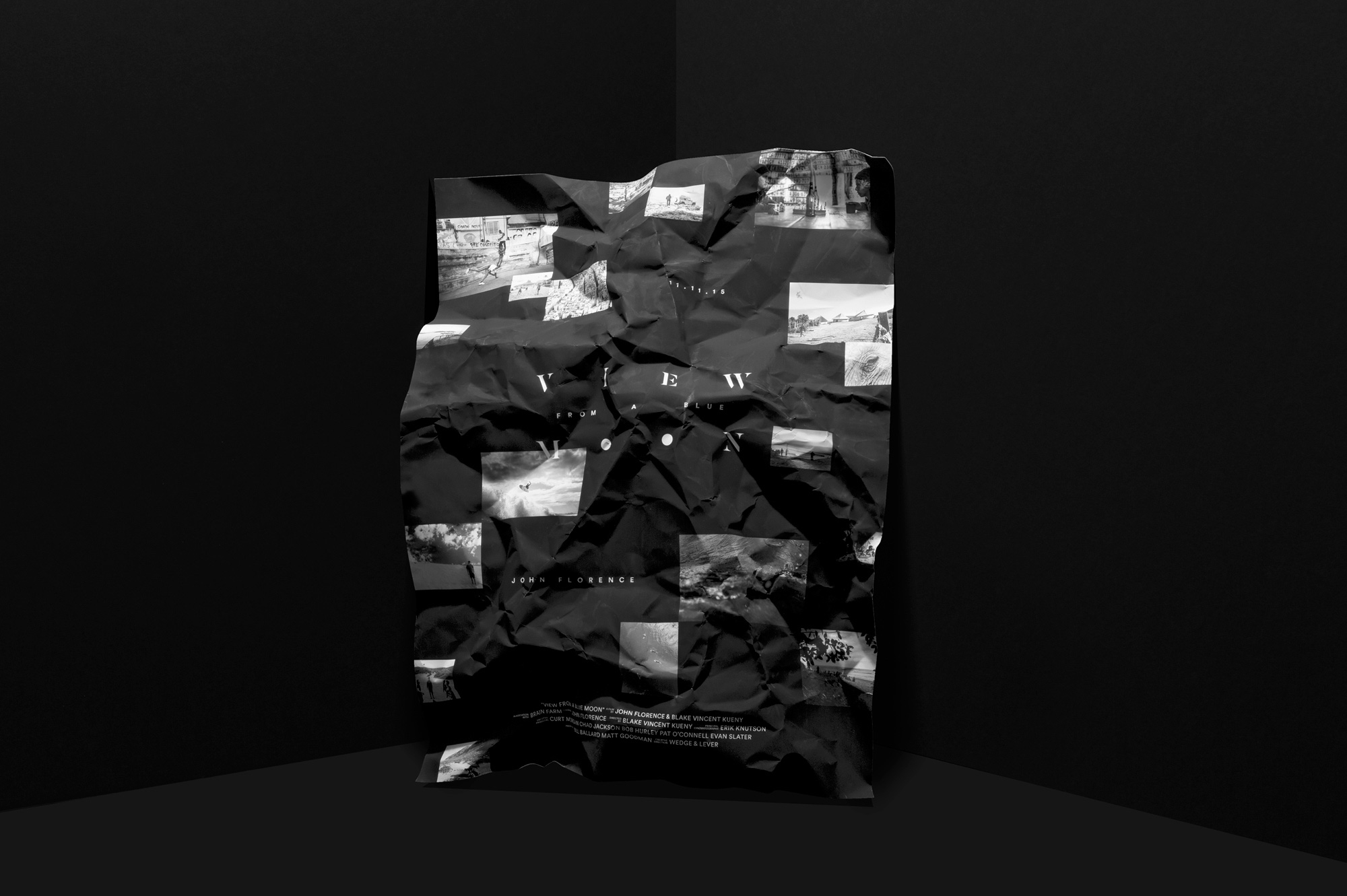
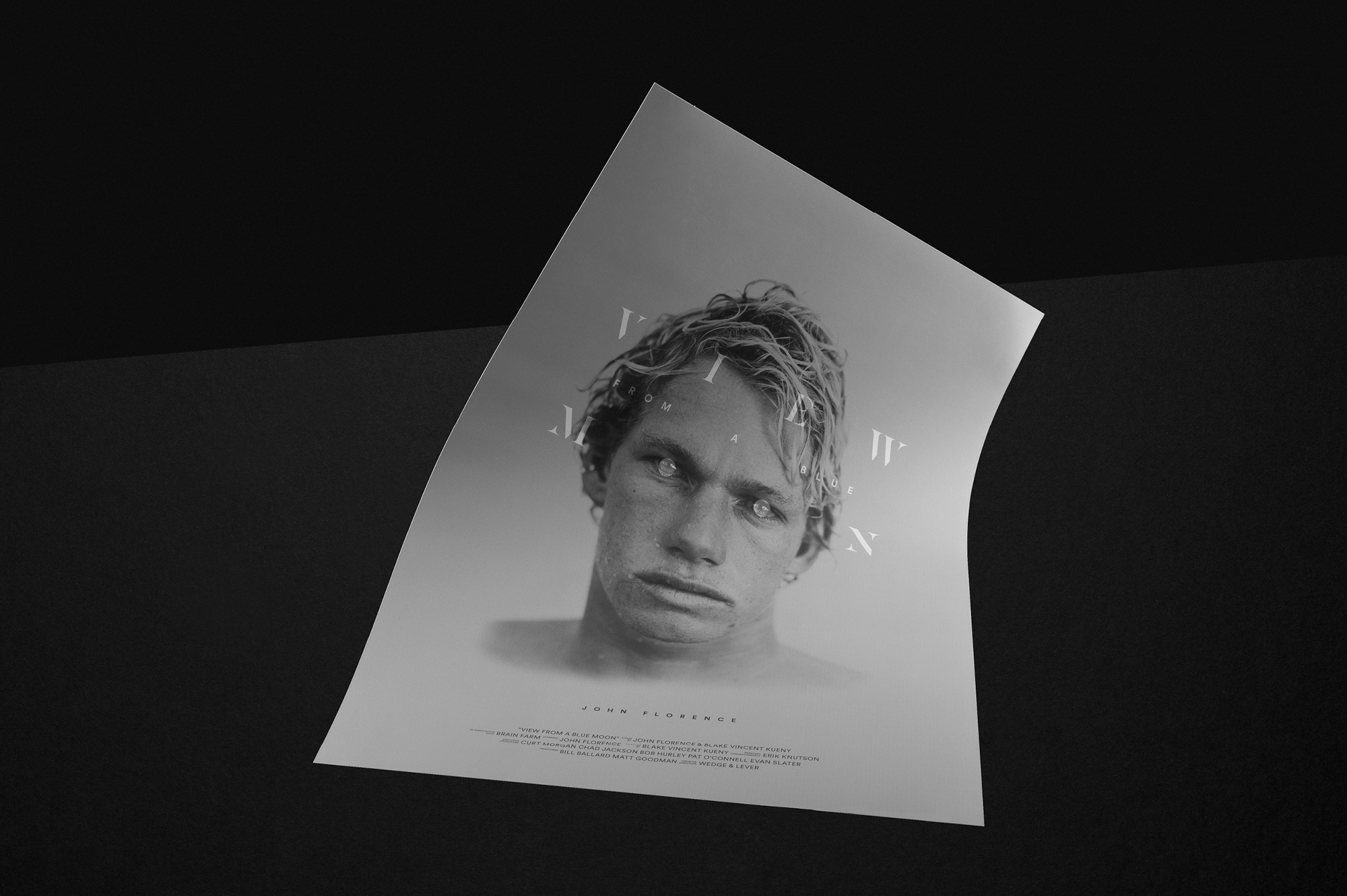
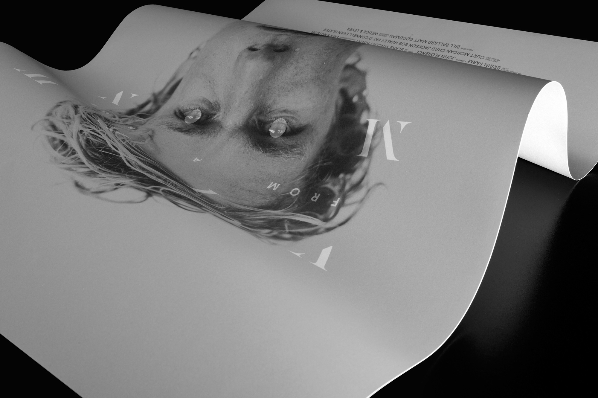
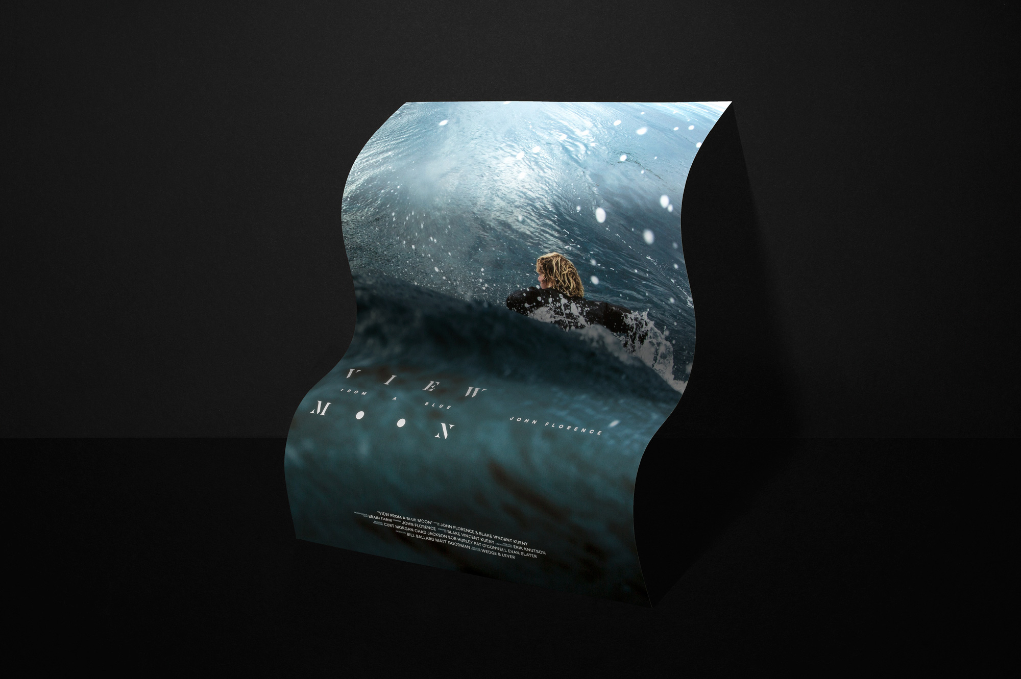
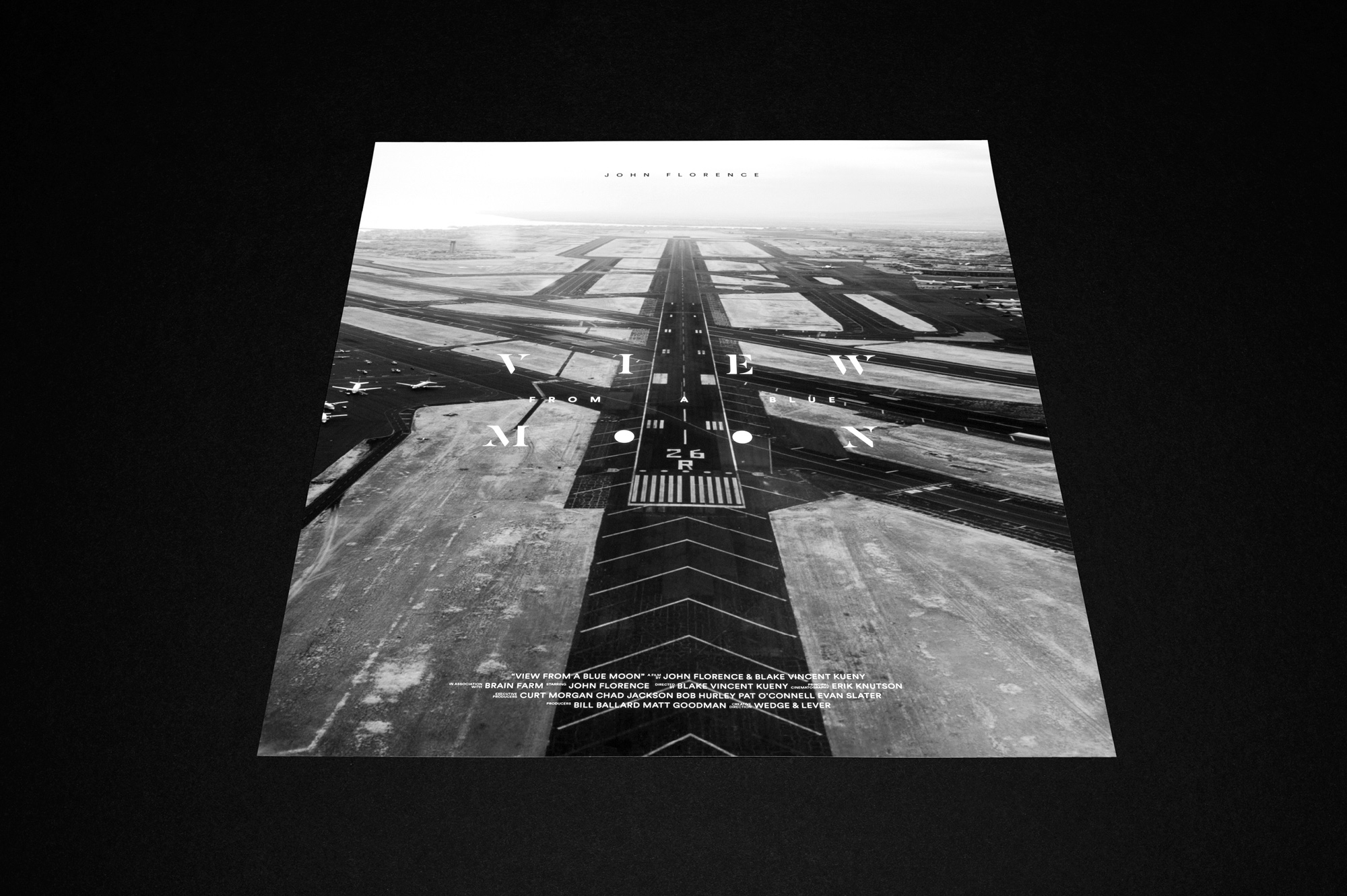
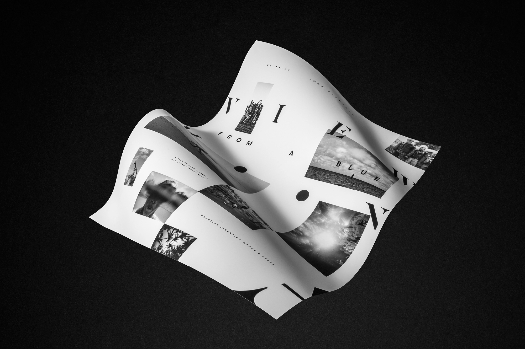
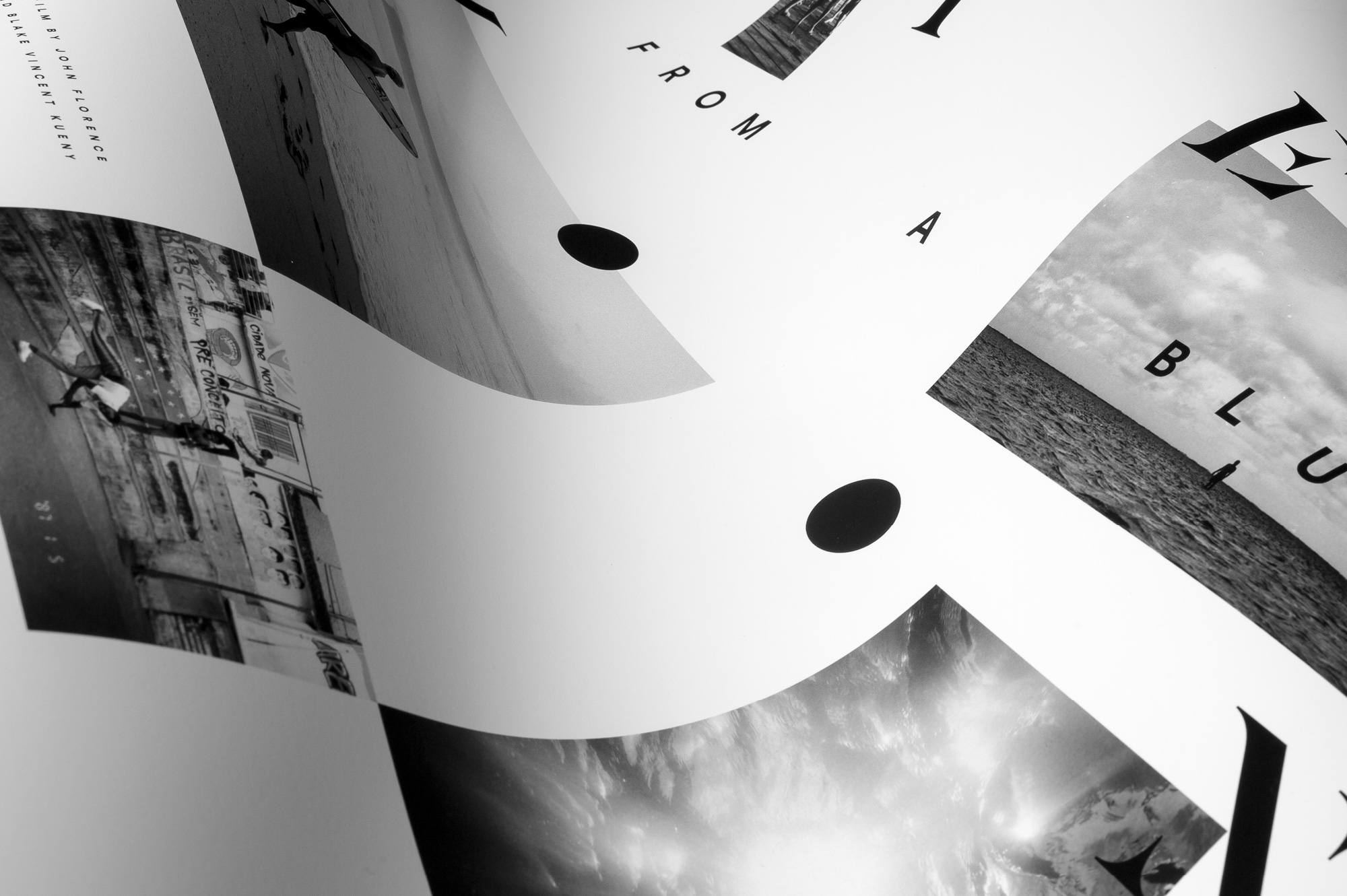
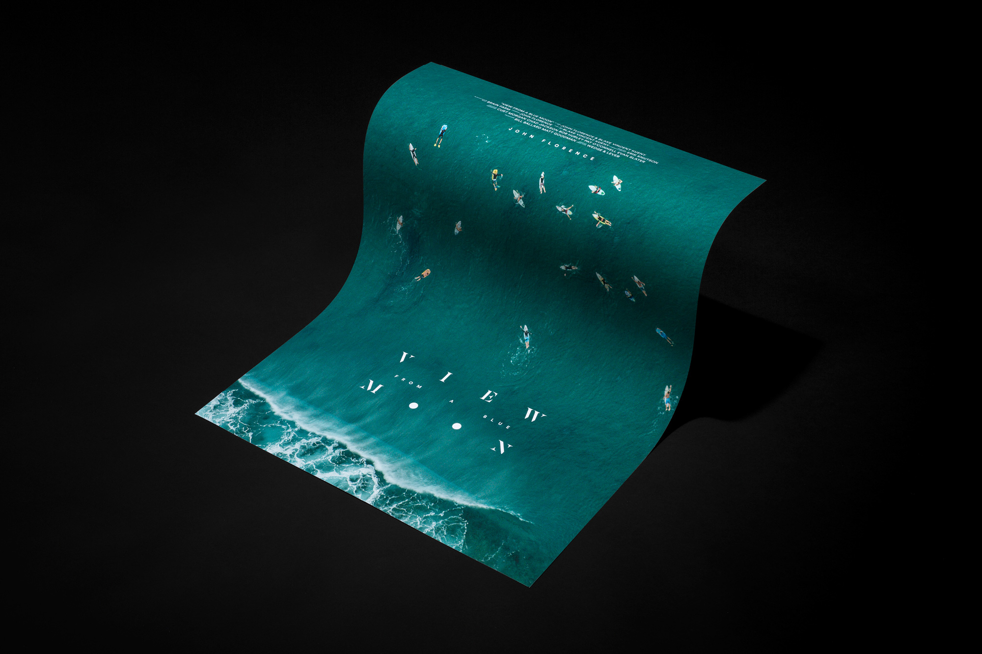
For the poster, we chose a candid shot of Florence sitting alone on a beach, staring out at a perfect wave, surfboard resting on his head for shade. The viewer experiences the wave, and the world beyond, from the same perspective as Florence. The resulting image is iconic, and pays homage to classic surf movie posters like that of The Endless Summer. We designed several limited edition posters, all of which play on perspective.

INSTAGRAM PRE-LOAD
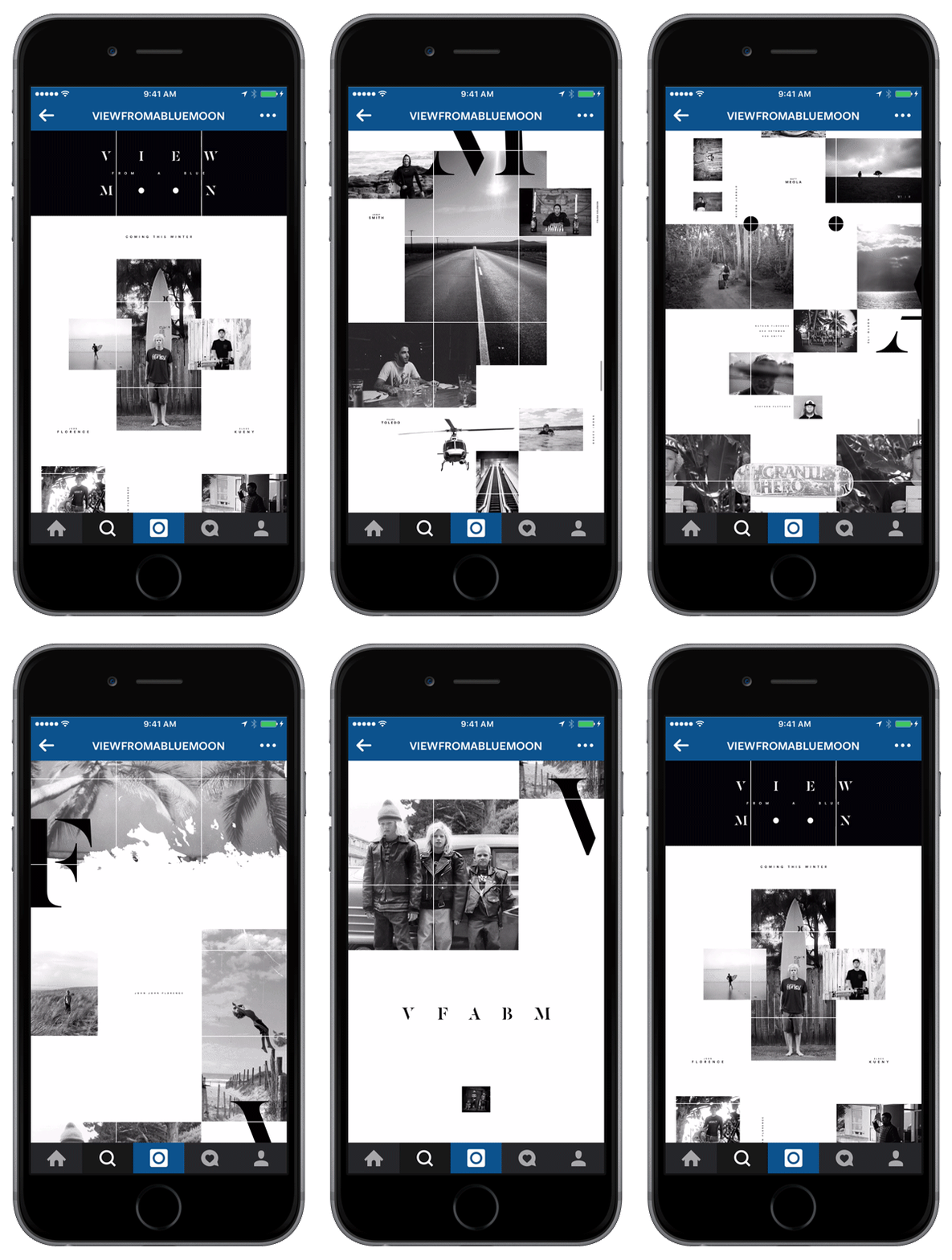
To capitalize on an expected exposure to tens of millions of Instagram users, we pre-loaded a three-up grid design that mirrored the structure of the film and introduced the cast. There were 11 limited-edition signed poster giveaways hidden in captions telling followers to repost for a chance to win; this was meant to foreshadow the 11/11 premiere date. Thousands of Instagram followers entered the contest.
WEBSITE
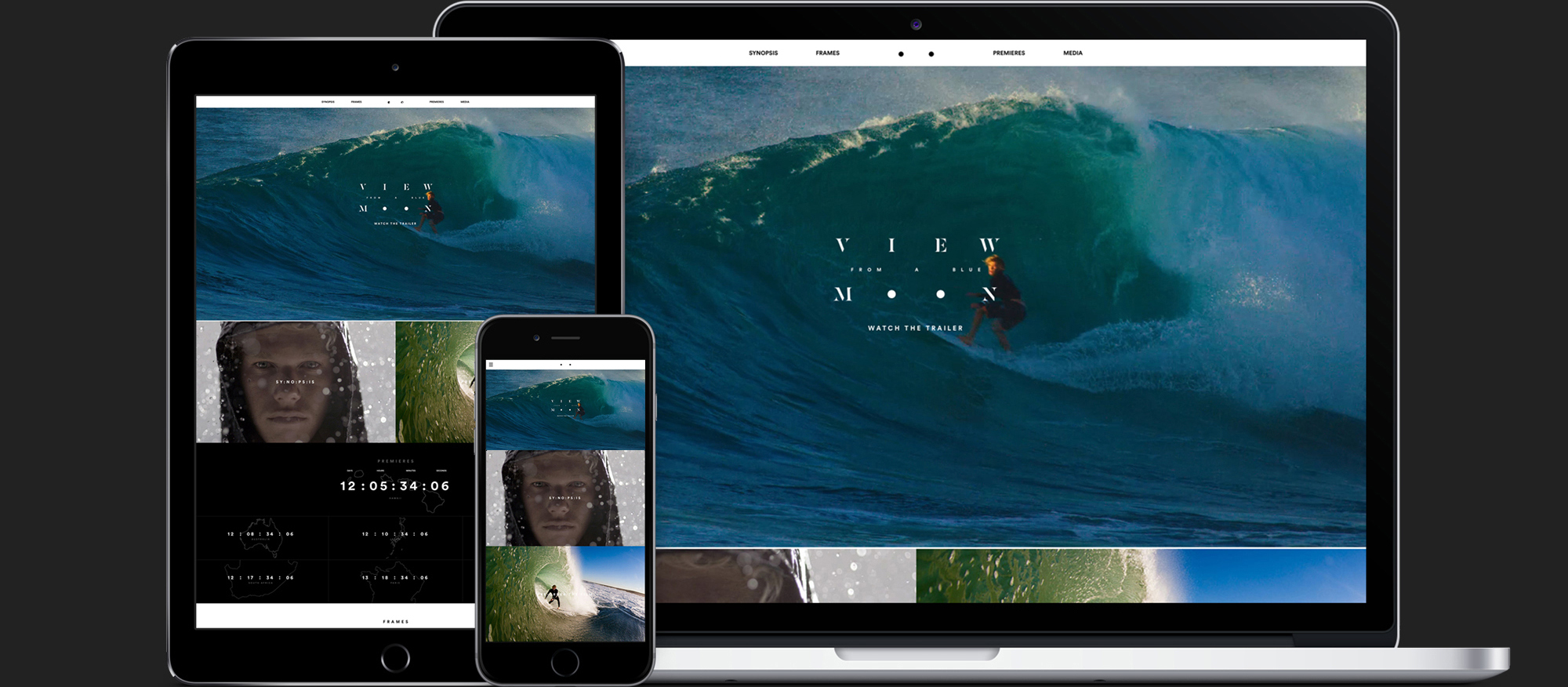
The website is the primary source for all content distribution. It presents key information in a user interface that’s simple, intuitive, and built around stunning visuals.
TEASER WEBSITE
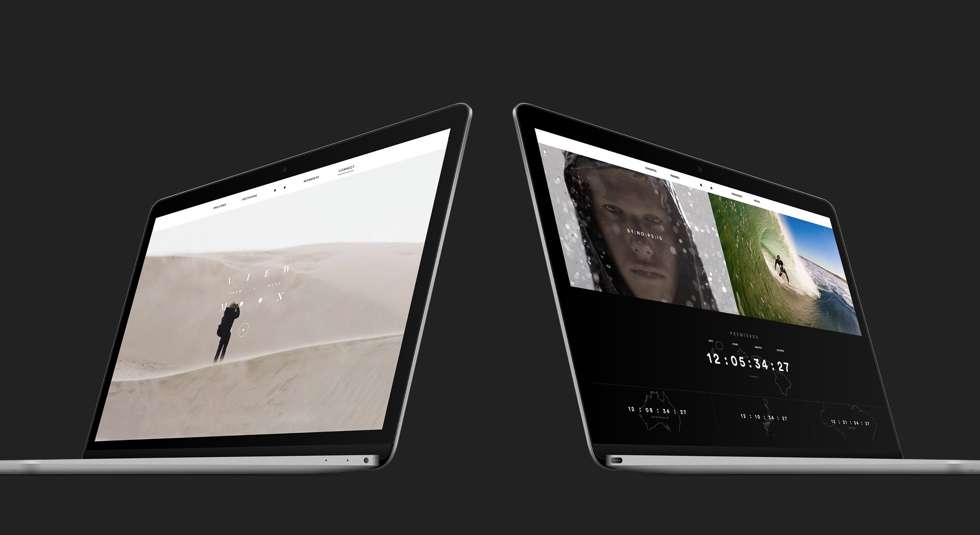
The initial iteration of the website placed emphasis on the teaser, which auto-played upon arrival. This was the reveal of the film title and the first video clip available to the public. Since anticipation for the film was running high, we wanted to provide a glimpse of select visuals from the film to generate further interest before announcing the global premieres.
LAUNCH WEBSITE
The launch website coincided with the release of the Trailer. It provided thorough background details: pre-order information, premiere dates, RSVP information, and clocks counting down to each of the global premieres. It was also created as a blogging and shopping platform so that it could serve as the base for all things View From A Blue Moon.

RESPONSIVE DESIGN
Everything on the website was designed for smooth operation on a variety of devices. The surfing population is a young demographic, accustomed to heavy mobile use, so we built the site to accommodate a flood of mobile traffic.
